Last updated on June 6th, 2021
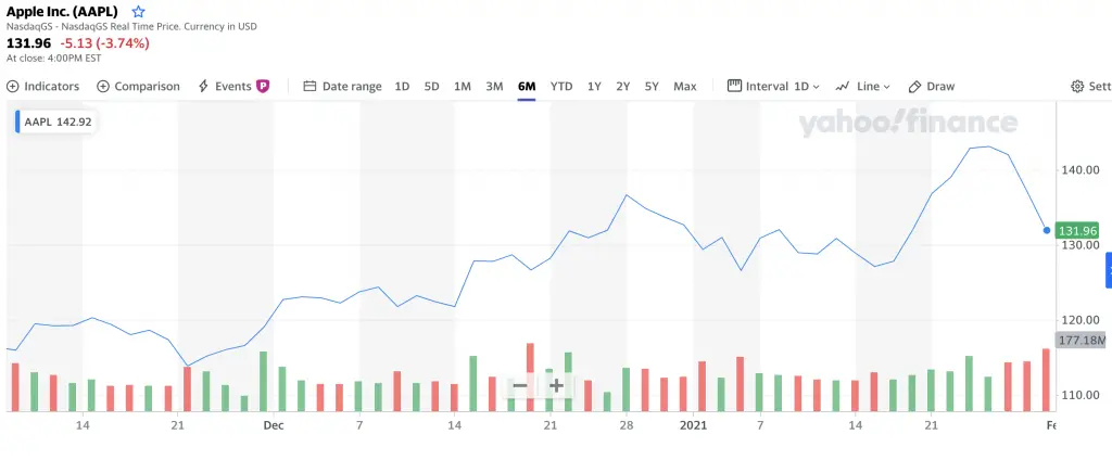
If you have looked at the price of any stock or ETF, you may have seen that the charts have some bars at the bottom.
What do these bars mean and represent? Here’s what you’ll need to know:
Contents
- 1 What are the red and green volume bars in a stock chart?
- 2 The volume bar will be green if the current close price is greater than the previous bar
- 3 The volume bar will be red if the close price is less than the previous bar
- 4 The period between bars can range from minutes to weeks
- 5 The length of the bar represents the trading volume
- 6 This concept can be applied to all volume bars in different kinds of stock charts
- 7 You can change the colour of the bars
- 8 Conclusion
What are the red and green volume bars in a stock chart?
The red and green colours on the volume bars represent how the stock’s price has performed relative to the previous period. If the price is higher, the bar will be green. If the price is lower, the bar will be red.
Here is a more in-depth explanation below:
The volume bar will be green if the current close price is greater than the previous bar
If the closing price of the current bar is higher than that of the previous bar, the volume bar will be green in colour.
For example, let’s look at Apple’s stock on Yahoo Finance and compare the volume bars between the 19th and 20th of January 2021.
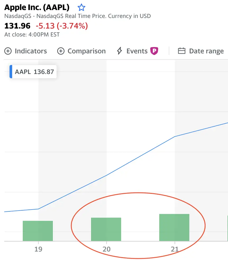
Here are closing prices for these 2 days:
| 20 Jan 2021 | 21 Jan 2021 | |
|---|---|---|
| Close Price | 132.03 | 136.87 |
The closing price on 21st Jan 2021 (136.87) was higher than that of 20th Jan (132.03). As such, the bar for 21st Jan will be green in colour.
This is also why the bar for 20th Jan is green too. The closing price on 20th Jan (132.03) was higher than that of 19th Jan (127.83).
If there are consecutive green bars, this means that the stock is on an upward trend! The colour of these bars will help you to visualise it much better.
The volume bar will be red if the close price is less than the previous bar
If the volume bar is red in colour, this means that the current close price is lower than that of the previous bar.
Let’s look at the same example for the Apple stock between 27-29 Jan 2021.
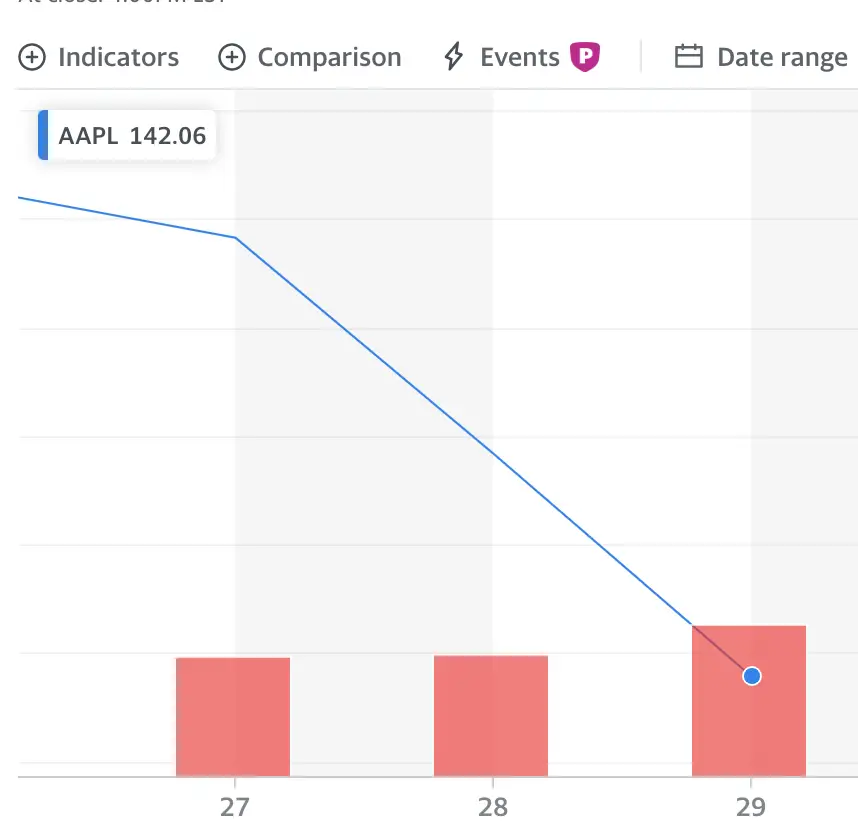
Here are the closing prices for these 3 days:
| 27 Jan 2021 | 28 Jan 2021 | 29 Jan 2021 | |
|---|---|---|---|
| Close Price | 142.06 | 137.09 | 131.96 |
There has been a downward trend in Apple’s stock price from 27-29 January 2021. This is why the volume bars for both 28th and 29th January are red in colour.
The red bars will help you to visualise this downward trend!
The period between bars can range from minutes to weeks
The colour of the bar always depends on the closing price of the current bar relative to that of the previous bar.
However, the period between 2 bars may not necessarily be 1 day! This depends on the period that you’re comparing the price of the stock.
If you are comparing Apple’s stock price over a 5-year period, the period between each bar is 1 week.
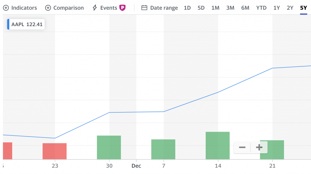
However if you’re comparing the stock’s price change in a day, it can be compared up to the closing price for each minute!
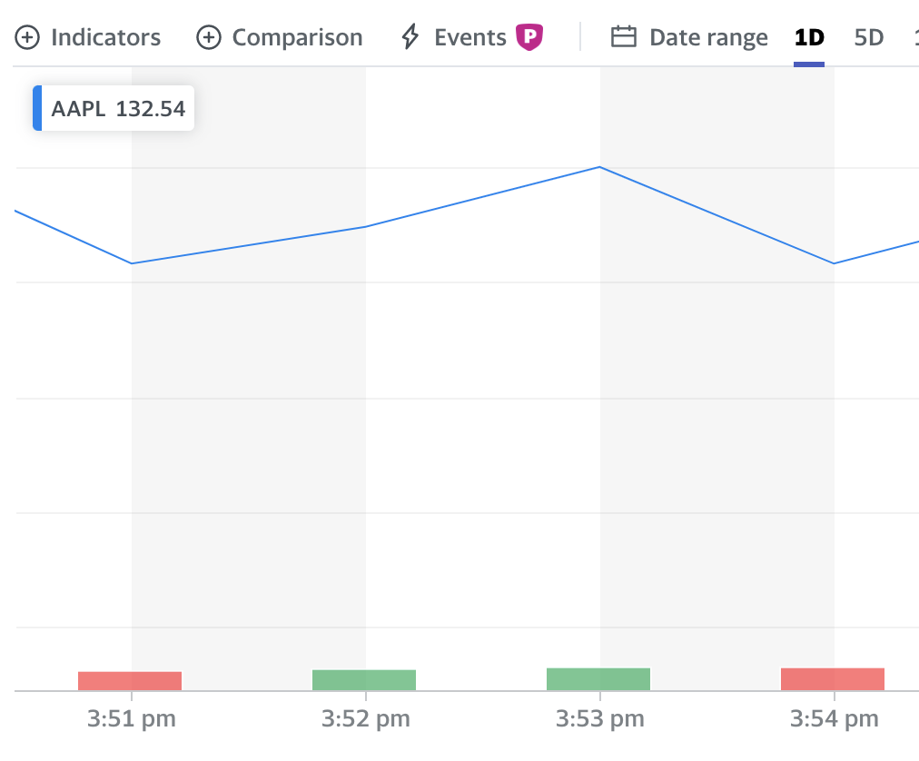
As such, it really depends on the scale that you wish to compare the trading volume.
The length of the bar represents the trading volume
The length of each volume bar represents the relative trading volume for that particular period, compared to other periods.
Let’s look back at the example from Apple.
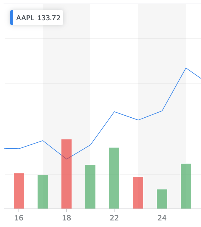
Here were the relative trading volumes for each of these days:
| Date | Trading Volume |
|---|---|
| 16 Dec 2020 | 98.21 million |
| 17 Dec 2020 | 94.36 million |
| 18 Dec 2020 | 192.54 million |
| 21 Dec 2020 | 121.25 million |
| 22 Dec 2020 | 168.9 million |
| 23 Dec 2020 | 88.22 million |
| 24 Dec 2020 | 54.94 million |
| 28 Dec 2020 | 124.49 million |
The bars show that 18 Dec 2020 was the day which had the highest volume of trading among these 8 days. This can be easily visualised by the height of the bars!
This concept can be applied to all volume bars in different kinds of stock charts
These volume bars can be found in most trading platforms. As such, the same concept can be applied to any platform that you use!
For example, the volume bars can be found on Tiger Brokers,
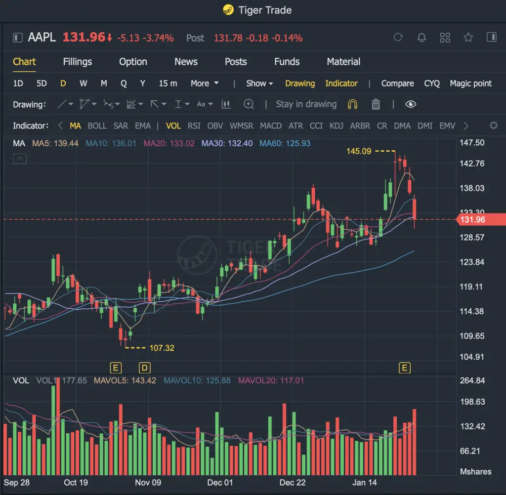
and Seeking Alpha (although the bars aren’t really that obvious).
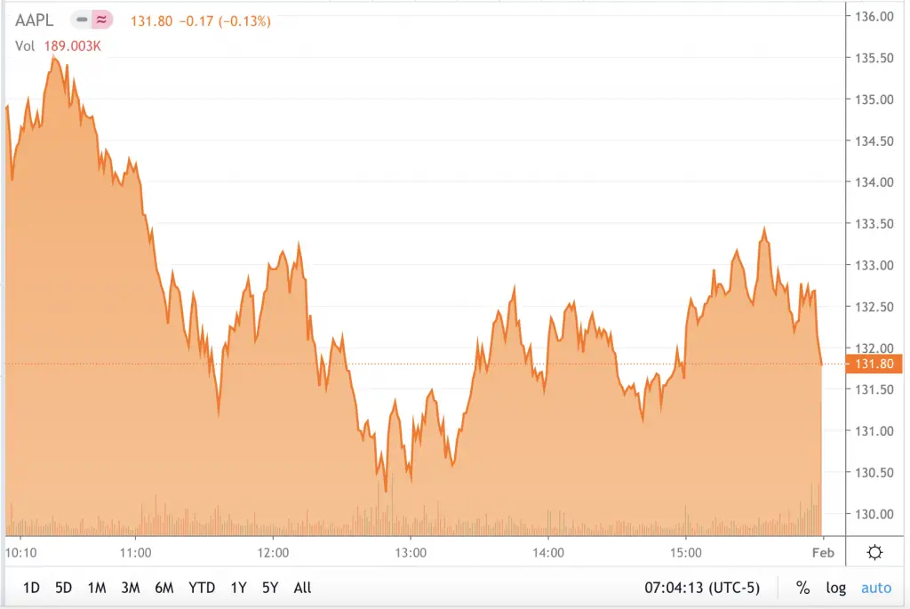
The meaning of the colour and height of these bars will be the same, no matter which platform you use!
You can change the colour of the bars
Some of these stock information platforms allow you to change the colours of the bars. For example in Yahoo Finance, you can click any volume bar to change the colour:
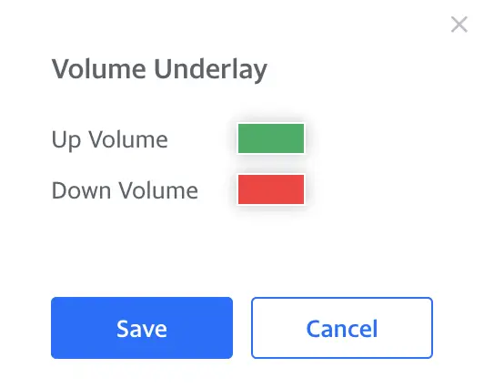
You can also change the volume bars on ThinkorSwim’s trading platform.
This helps you to customise the charts to how you like them to be!
Conclusion
The colour of the volume bars show the relative closing price of the stock for that period compared to the previous period. Meanwhile, the height of the bar shows the relative trading volume for that period.

Do you like the content on this blog?
To receive the latest updates from my blog and personal finance in general, you can follow me on my Telegram channels (Personal Finance or Crypto) and Facebook.
Are you passionate about personal finance and want to earn some flexible income?

